Outlining my UX discovery process for a cancer screening app
I worked as a UX designer for the discovery phase of a mobile app that aided in the early diagnosis of oral cancer. The app’s goal was to bring standardization and accuracy to the interpretation of the test results.
The problems
The existing manual oral cancer tests that were being administered were producing results that were too subjective. Frequently, the medical professionals that administered & reviewed the tests had disagreements with their colleagues on the results, which led to disagreement on the subsequent treatment plan.
Specific points of confusion centered around a “positive/negative” test line and differentiating between an important color change that indicated a patient’s particular protein level - an important factor in determining a client’s risk for oral cancer.
Another problem we had to address was variance in image quality. Healthcare professionals work in fast-paced environments and must be highly efficient. In addition to all of their other work responsibilities, it is difficult to expect that they will be able to take quality, standardized photos of the test results each time using the app.
My role
I wanted to learn more about who will be using the app and how it will be used. In an attempt to learn more about the users, I set up interviews with dental hygienists and dentists.
User interviews
In the interviews, we discussed their backgrounds, their current workflows, the strengths and weaknesses of the existing manual product as well as features they would like to see in the app. I recorded and summarized the sessions with the interviewees for my team’s reference. The goal was to use this information to help drive the design for the new app.
The interviews helped to provide good qualitative feedback on some hypotheses I was looking to validate. For example, I noted a few themes that emerged:
Medical and dental offices are frequently overbooked/crowded and “time is money.” One physician reported occasionally seeing as many as 60 patients in one day.
In a fast-paced environment with so many patients, healthcare professionals taking consistently standardized, high-quality photos is unreasonable.
Multiple healthcare professionals will be working on just one OncAlert RAPID testing station within a typical office.
If the app disrupts workflow, user adoption will suffer.
Some patients may exhibit risk factors for oral cancer while they test negative. Therefore tracking patient results over time is important for the doctor’s ability to provide effective care.
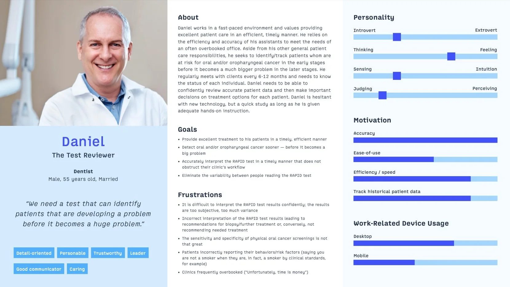
Creating user personas
Using all of the information that I gathered from the interviews, I then created user personas that served to visually represent the goals, frequent frustrations and general background information of the future users of the app.
I created two personas that helped to drive our design efforts

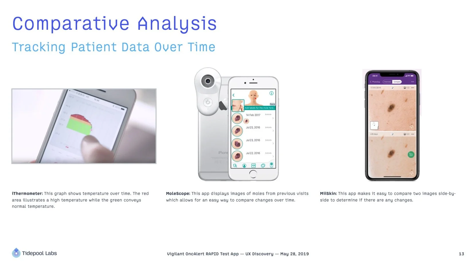
Comparative analysis
During the discovery phase, I find it important to understand how other competitors, apps, etc. solve similar challenges. In order to better understand this, I researched the functionality of a variety of apps to understand the following:
Learn about other apps that aid in the detection of cancer and interpret test results
Learn how other apps take photos of test results
Learn how other apps create intuitive UX that can be implemented in a clinical setting with multiple users
Learn how other companies show historical patient data and results
The comparative analysis led me to the following examples that I intended to use as design inspiration in the upcoming wireframing and prototyping phase.


Strategic recommendations
By this point, I felt prepared to make some initial, strategic recommendations. They were as follows:
1. Intuitiveness and ease-of-use are critical to user adoption.
Medical and dental offices are frequently overbooked and crowded. If the app disrupts workflow, user adoption of it will suffer. The app must be extremely intuitive and easy-to-use while providing accurate and reliable results.
2. Taking standardized photos within the app will help bring accuracy to the interpretations of test results.
Through the use of visual aids, color calibration, auditory alerts, a phone stand and clear in-app instructions for use (audio & video), we must standardize the quality of the test results photographs, thus improving the accuracy of the interpretation of the test results.
3. Multi-user functionality will allow for a variety of health care professionals to use the app in the collaborative environment of a clinic.
The app will be used by a variety of user types within an office. Some users will more often administer the test (e.g. hygienists, nurses) while other users will more often review the results (e.g. physicians, dentists). To account for this, the app must allow for multi-user login functionality (e.g. pin pad entry).
4. Tracking and presenting patient data over time will improve decision support.
Easily understandable data visualization of patient test results over time (e.g. line graphs that show CD44 and total protein levels over time, comparative photos from previous visits) will help providers better track historical patient trends and improve treatment and care.
Transitioning to the design phase: creating user flows
My UX design process requires that I create user flows before moving to more high fidelity wireframes, interactive prototypes, etc. For a complex app such as this one, creating a strong user flow was especially critical.
For example, this app dealt with a variety of tasks such as viewing, creating, editing, importing and deleting patient records.
Wireframing & prototyping
While I am comfortable in nearly all prototyping software (e.g. Figma, Sketch, Balsamiq, Axure), I used Axure to put together the initial wireframes for the various app screens.