A/B Testing: A minor tweak leads to a major improvement
Sometimes the smallest design tweak can lead to big success. This featured A/B test, which altered the placement of a call-to-action, serves as an example of this.
Overview
While working for a publisher near San Diego, California, my role on the team was conversion rate optimization strategist. Essentially, my job duties involved coming up with ideas for A/B tests.
Generally speaking, my ideas for A/B tests come from three major areas:
Reviewing qualitative data (e.g. voice of customer data, feedback from usability tests)
Reviewing quantitative data (e.g. web analytics, heat maps)
Best practices & past A/B tests (e.g. repeating past successful tests, modern design trends, conference insights)
In this example, I felt that there was opportunity for success by making a very simple update to an ad unit on the website. There were several reasons why I felt that we should focus on redesigning this ad unit, such as:
Minimal improvement in conversion rate would lead to large financial gain based on the importance and prevalence of the ad unit.
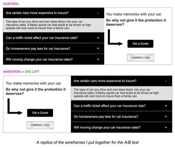
Based on findings from a Nielsen Norman Group article entitled “Horizontal Attention Leans Left”, I felt confident that if we move the call-to-action to the left, we will see improved engagement with the CTA because web users spend 80% of their time viewing the left half of the page and 20% viewing the right half, according to the article.
The proposed update was simple! Little effort could potentially lead to large financial gain
Results
After launching the A/B test, we were pleased to see a statistically significant 25% lift in conversions which lead to a sizable revenue lift.